Why Craft Kombucha?
As I was given a task to rebrand a Kombucha company, I went searching for a Kombucha company in need of a rebrand. Upon looking through the lists of kombucha companies in America, I stumbled upon Craft Kombucha‘s logo. When first looking at Craft’s logo I felt like it is a Vintage themed business. As I went through their website, I was taken by surprise when the logo is the founder’s dog. Later on, I went for further research about the brand and decided to have Craft Kombucha to be a subject for the task of rebranding a Kombucha company.

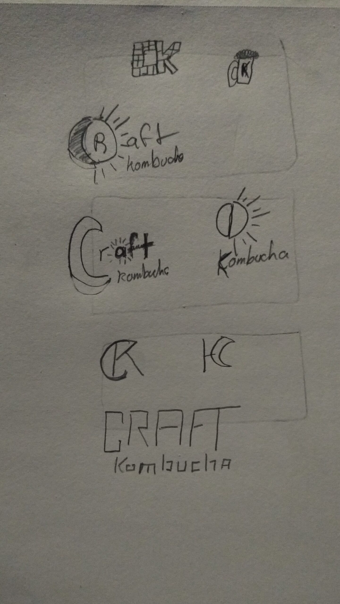
Crafting Craft Kombucha’s new look
As further research was made, I decided to go through many versions of the logo and finally concluded with a crescent wrapping itself around the top left corner of the C in Craft. The reason I went for a more patriotic style to express the company is to emphasize the place Craft Kombucha was founded, in Washington DC.
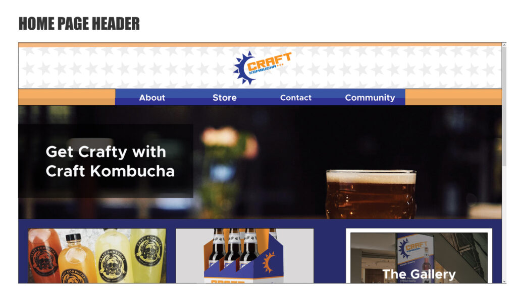
Making Crafts Website
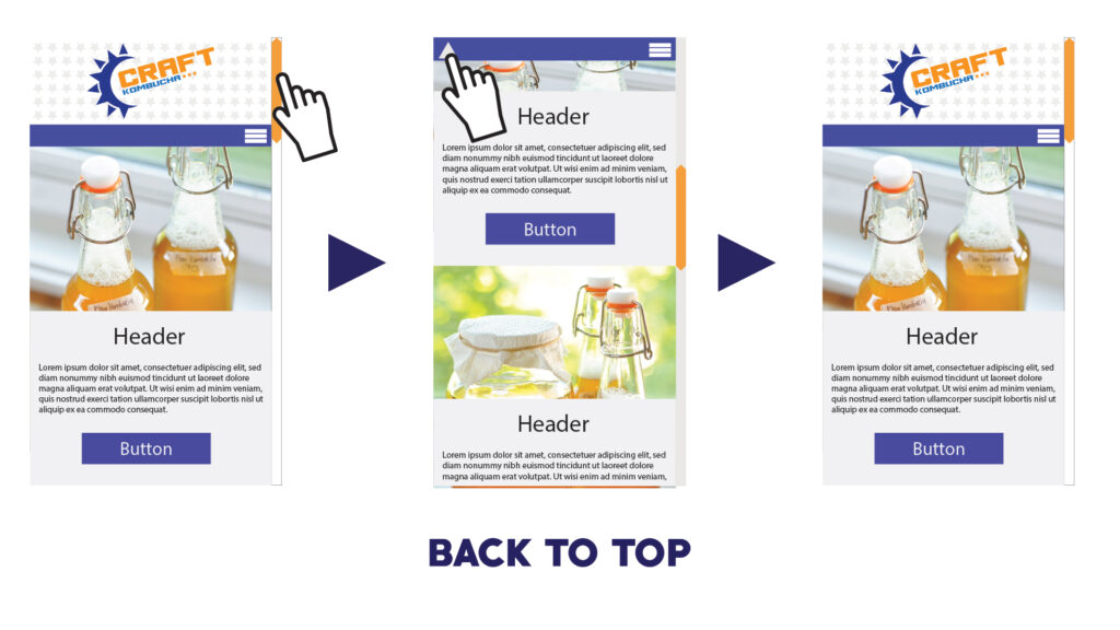
As the construction of the rebrand is coming to a close, the final piece to the rebrand is to create a web layout. One of the main obstacles of Creating the Web layout is to consider Responsive Design. Starting with the company’s current website, inspirations were taken and I decide to make a more “post-like” appearance to the website. Of course, I have to stick to the style of the rebrand for a more sporty and patriotic feel.