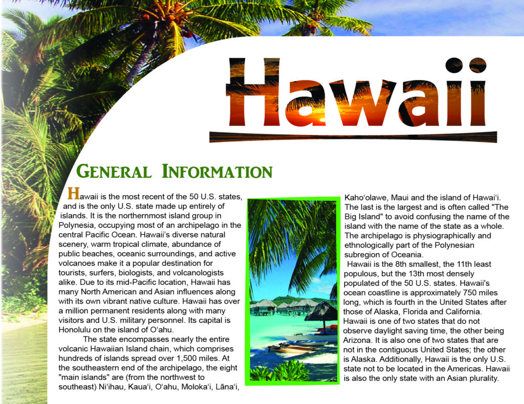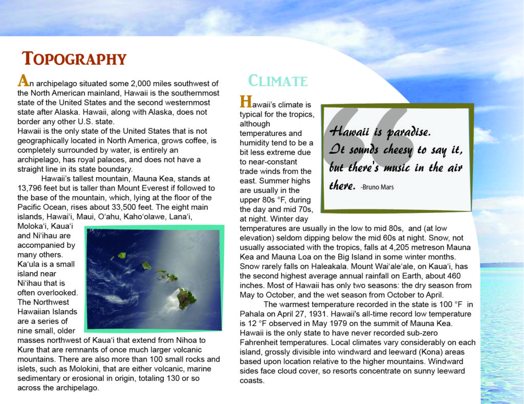
Hawaii Layout Left
Making the Hawaii Layout
This was an assignment for exercising my skills in making spreads for books and magazines with proper typography. Over time I showed improvements on applying an appropriate background and color scheme to compliment the amount of text provided. The use of a pull quote was also applied to show that I am also good at applying elements to the spread to have a good balance between body text and Imagery.

Hawaii Layout (Right)
What is used and Method
I used a variety of different resources from the internet to compile them into the Hawaii layout. The Pull-quote was used from Brainyquote, the fonts used were AR Julian, Helvetica, and the two used for title and pull-quote are AR prefix. The program is originally used in Adobe Illustrator, I switched to Adobe Indesign when I understood that program more. The images were searched images found through a google search after an extended time of searching.
When Using the body text, I kept a good distance between the body text and the edge of the spread, avoiding unnecessary cuts. I also adjusted the Leading and kerning of the body text and headers.
- Pull Quote
- Relevant imagery
- Headers
- Text wrap
- Masking
- Gradient
- Layer Masking


