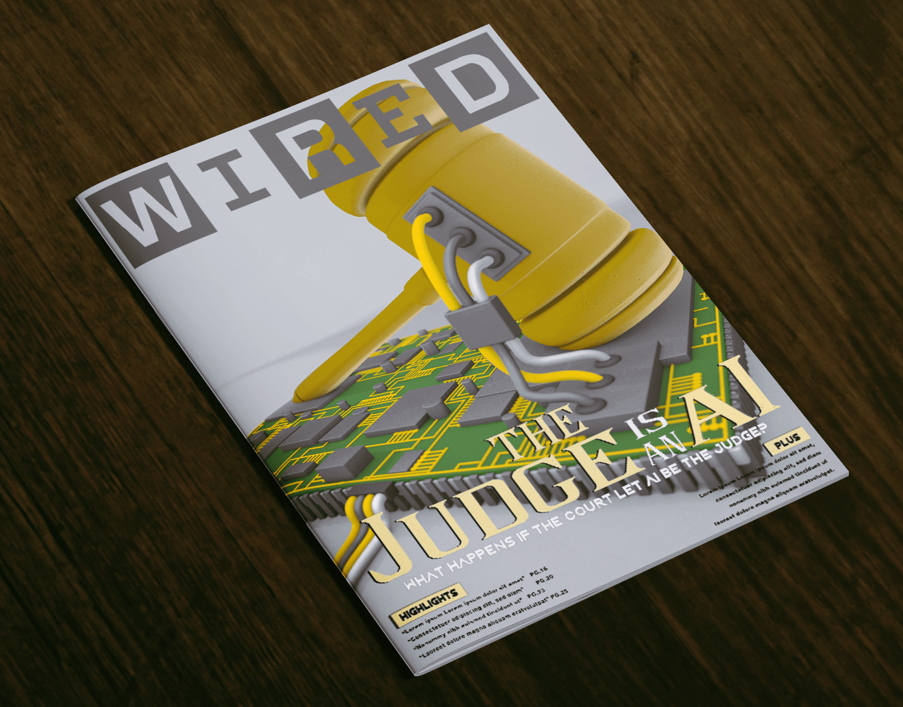
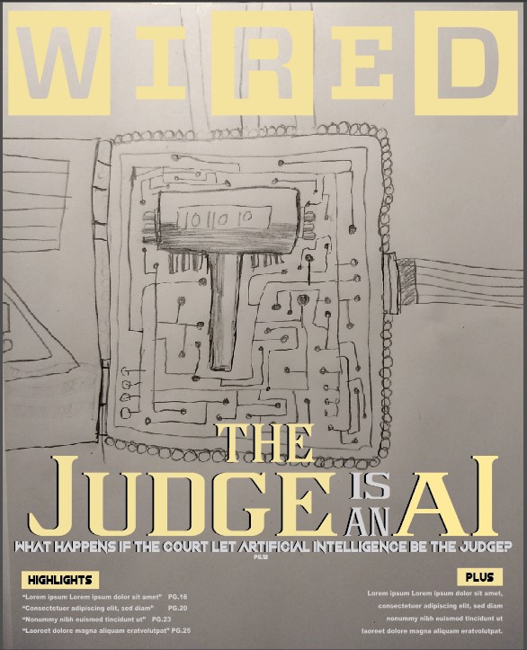
The creation of the 3D Model “The Judge is an A.I.”
Why the subject? Before creating the 3d model, I did some searching through other magazine covers to find a striking topic for 3d modeling. During the search, I noticed that some covers contain topics that fail to entice the audience to continue reading. There are also the few covers that have good topics for luring the audience but the graphic drives fail to keep…
“The Judge is an A.I.” – Magazine Cover
Summary Magazines and news articles are talking about artificial intelligence being implemented into the court system. The purpose for this magazine cover is to spread awareness of this information and have people wondering about the pros and cons for having Artificial intelligence in the court. Having the magazine method, it is good to let people who don’t often go to the internet know what…
Animated Logo
How it’s Done When making this animated logo, I started setting the document size to 250×250 pixels running at 24 FPS (Frames Per Second). Doing this will set the minimum file size for the Animated Logo GIF while maintaining a decent appearance for the GIF. The Fades I later used the WIN Logo and pressed Control/Command + B to break apart the logo then…
1st Successful Catalog
Catalog This is a Product catalog, a follow-up for the Product Photography, This contains all product photos and a few tricks were used for providing a proper theme and style to best fit with the provided photography. Tricks When using InDesign I used the frame tool to have a sampled wood texture in the background, it was first a square, then for the circular…
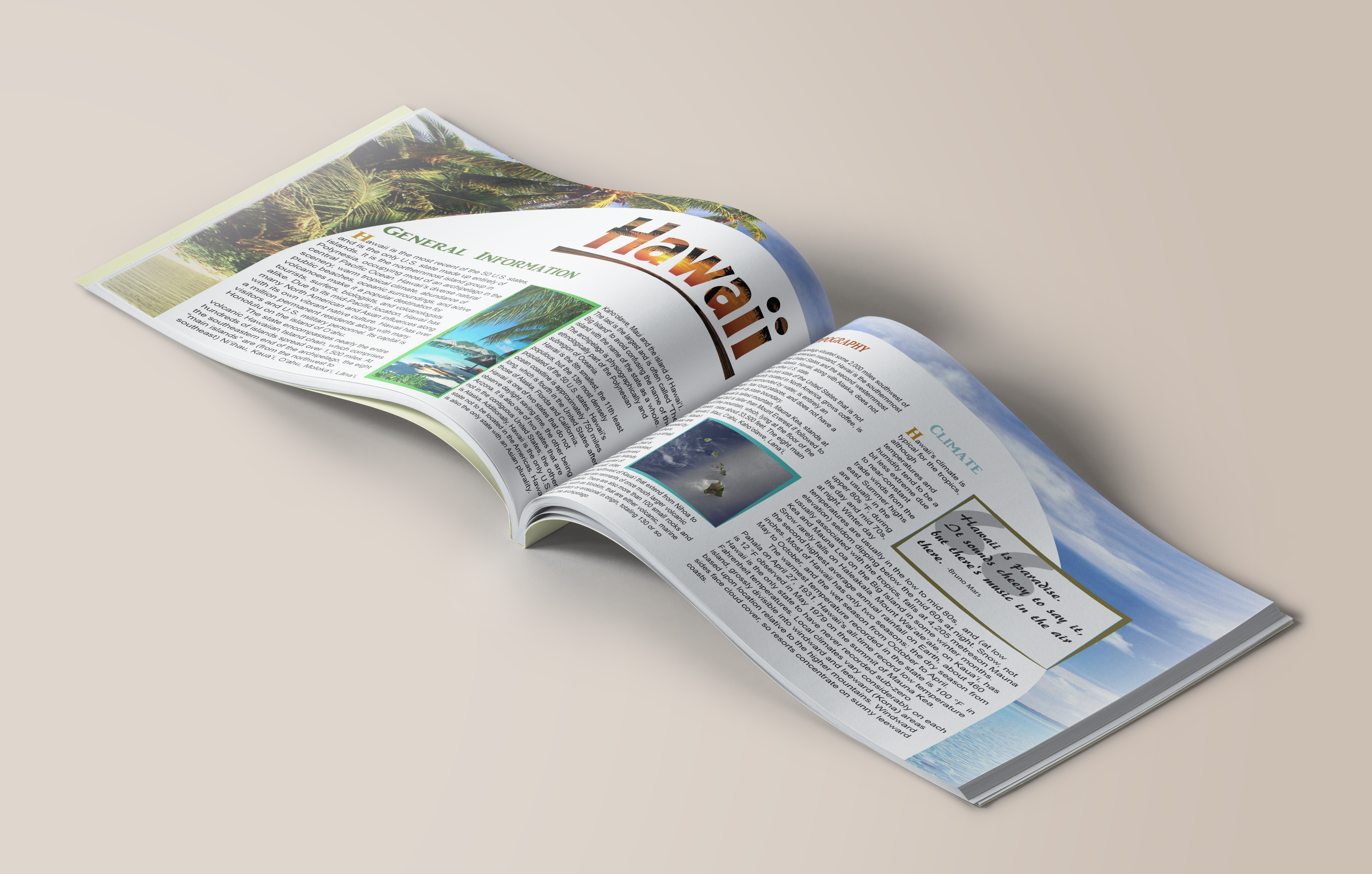
Hawaii Layout – Print Design Practice
Making the Hawaii Layout This was an assignment for exercising my skills in making spreads for books and magazines with proper typography. Over time I showed improvements on applying an appropriate background and color scheme to compliment the amount of text provided. The use of a pull quote was also applied to show that I am also good at applying elements to the spread…
The Growth of Windesign – 1st brand self-identity
Windesign is the very start of how my brand became to be. I started off with only sketches, really rough sketches of my initials. I was mentioned later that I should try with the pronunciation of my last name since it sounds like the term “WIN”. I then started playing with the words and resulted in Windesign. Sadly, months later I found out that…
Red Barn Coffee Rebrand
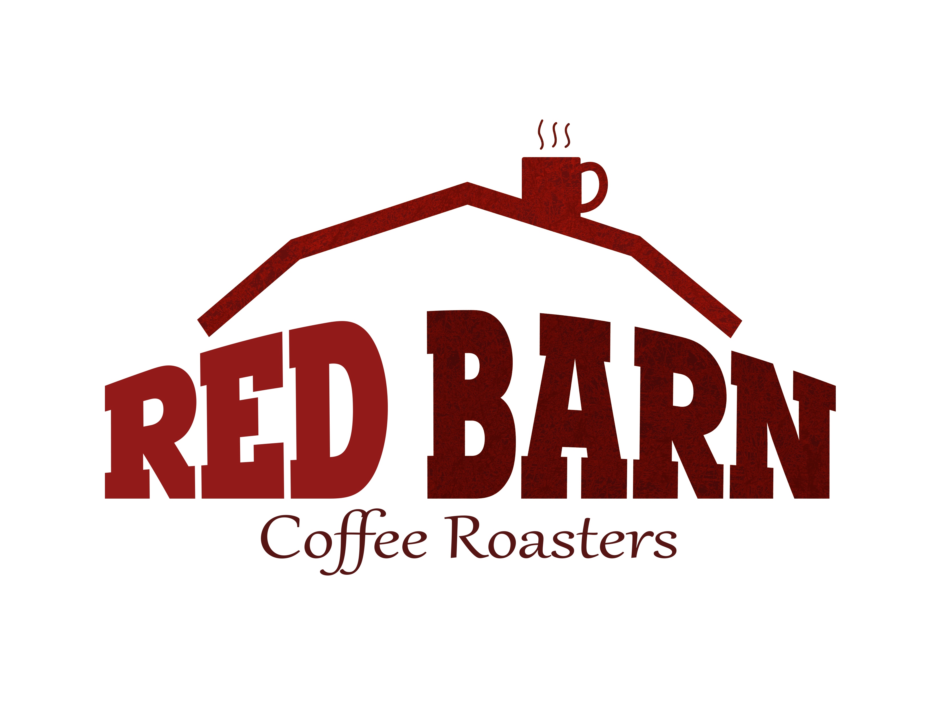
Changing the Logo When I was assigned with rebranding Read Barn Coffee Roasters, I didn’t like how the original logo was an old fashioned stamp, so i decided to go with a more Bold and Rough font, I was stuck to the thought of being in a red barn house so I went with the questions “What makes a barn house distinctive?” I went…
Fizzing the Faygo Soda Rebrand
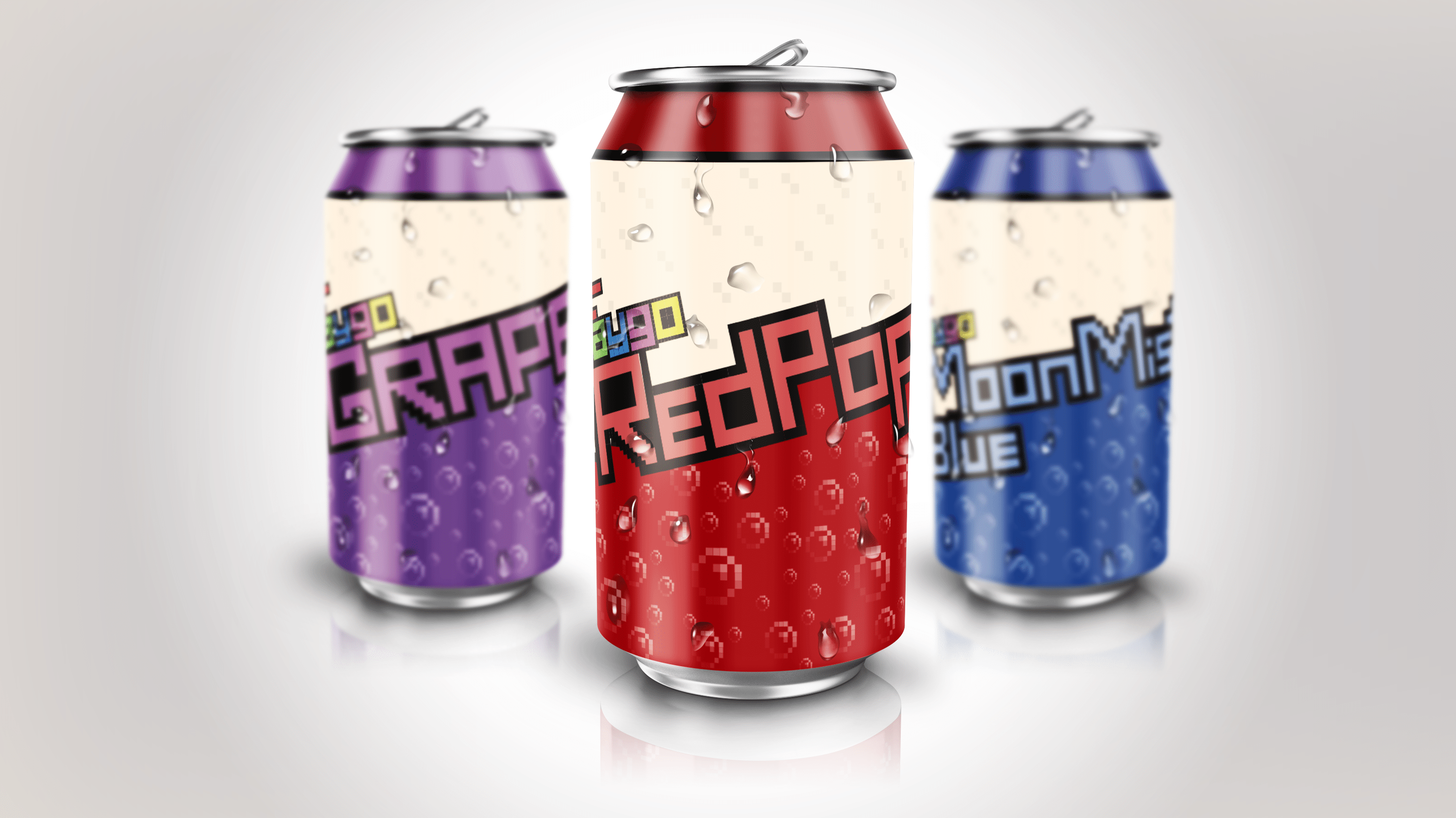
Mockup Supplied By: Zoki Desgn Can Design By: John Nguyen How it’s Done I decided to rebrand Faygo’s logo, however, I didn’t know where to start and what kind of logo I should go for. I later went to the website and gathered information of their history how they have the Faygo kid and how they have gamification. So then I went with their…
Horror Book Covers – 1st Print Design
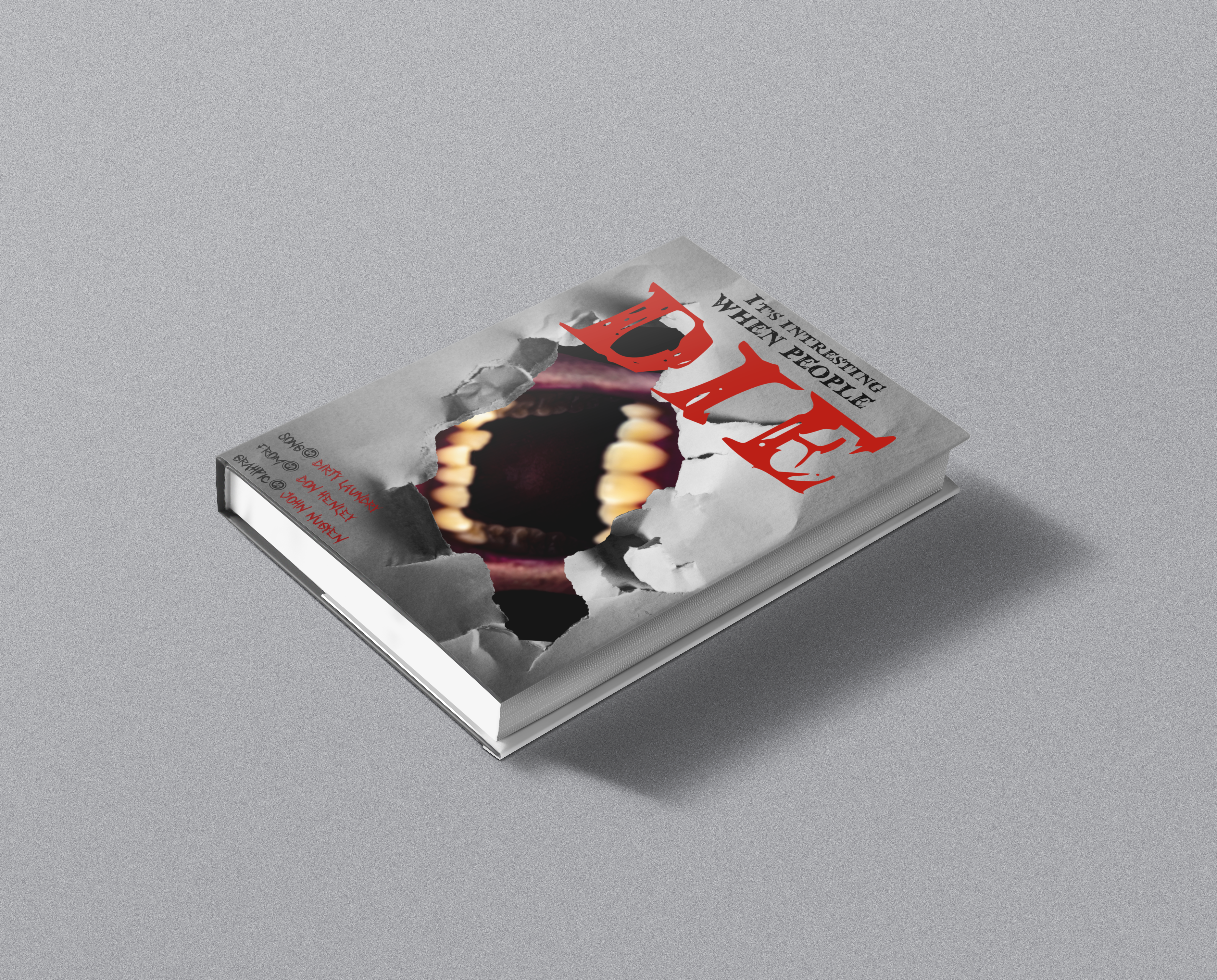
This was an assignment given to test my creativity by using multiple programs in Adobe CC. I have to make a horror book using a piece of a song’s lyrics, specifically an old song before the 80s. We also have to use 3+ custom elements in the mockup. Used Method I decided to go with photography and went by using several minor sources that…
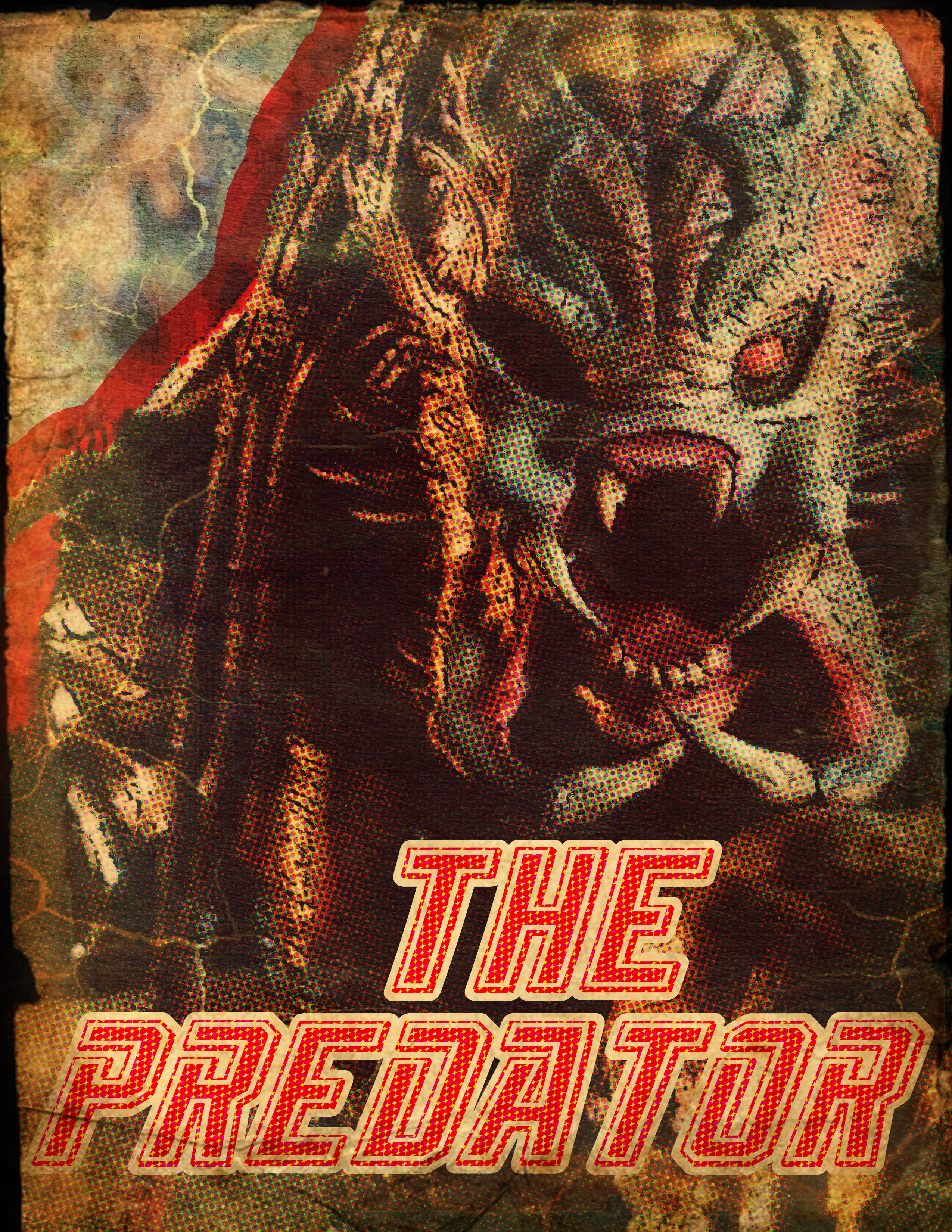
Pulp Movie Poster – 1 New Movie with 1 Old Style
I was assigned to design a Pulp Movie poster, Old Pulp Paper Style. The choice of movie was a recently released movie(movies in 2018). So I went with making 2 posters one with enlarged “pulp circles” and one with decently sized pulp circles. At the time I didn’t know how to make Pulp movie posters, so I had to do some research. Mostly photoshop…

