Mockup Supplied By: Zoki Desgn
Can Design By: John Nguyen
How it’s Done
I decided to rebrand Faygo’s logo, however, I didn’t know where to start and what kind of logo I should go for. I later went to the website and gathered information of their history how they have the Faygo kid and how they have gamification. So then I went with their current badge shape and have the 8-bit style to show their gamification.
Mockup by: Pixden
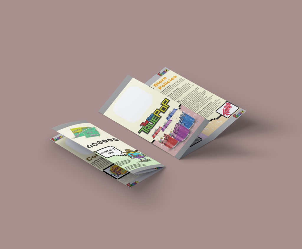
The Brochure
After creating the Logo, I was assigned to create a brochure along with an isometric map of the company’s location. When creating the brochure. I have to strategize on the type of font that would go with the 8-bit style and how an isometric map can fit in with the style of the brochure. The biggest problem is the choice of colors for the brochure.
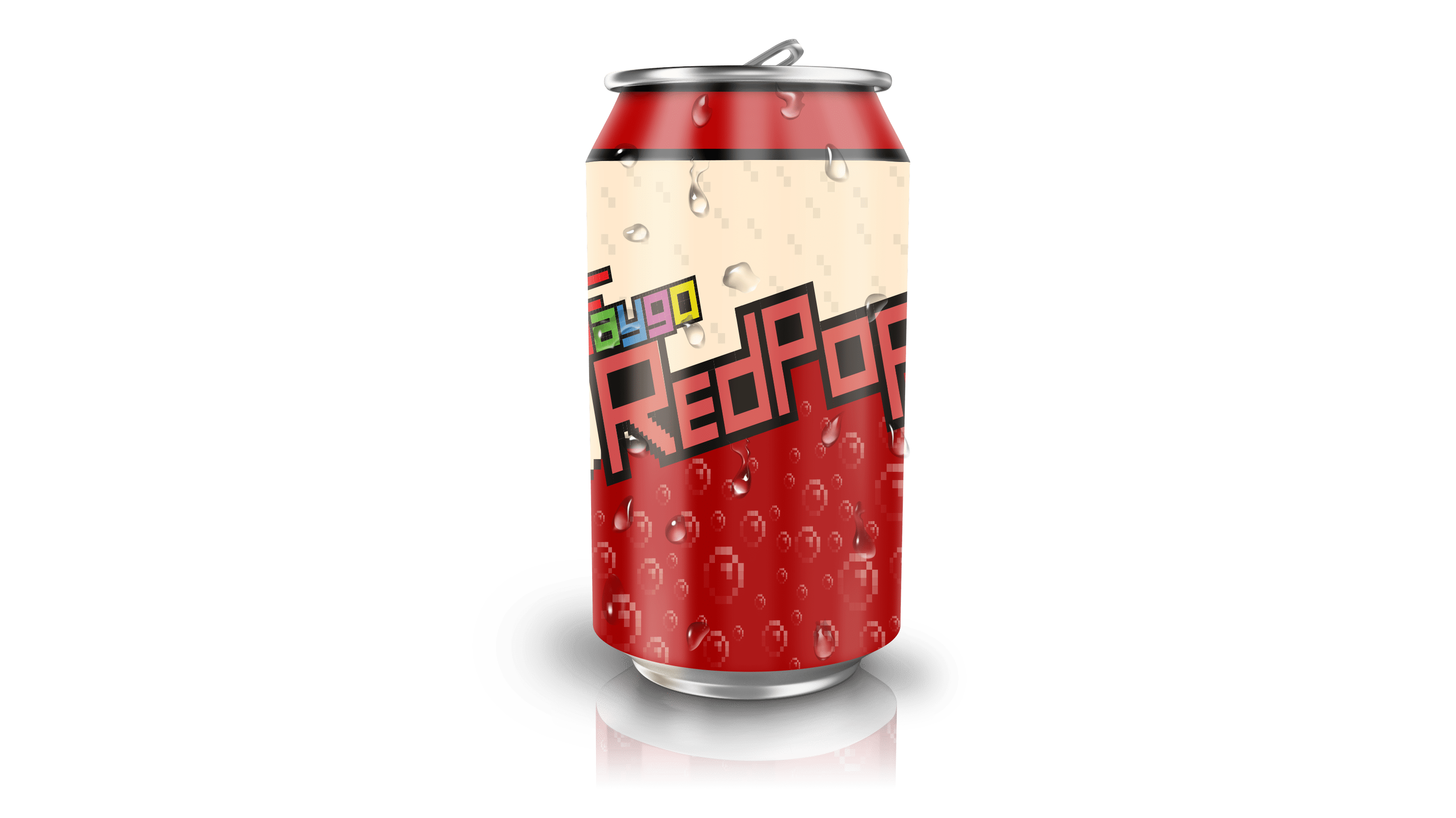
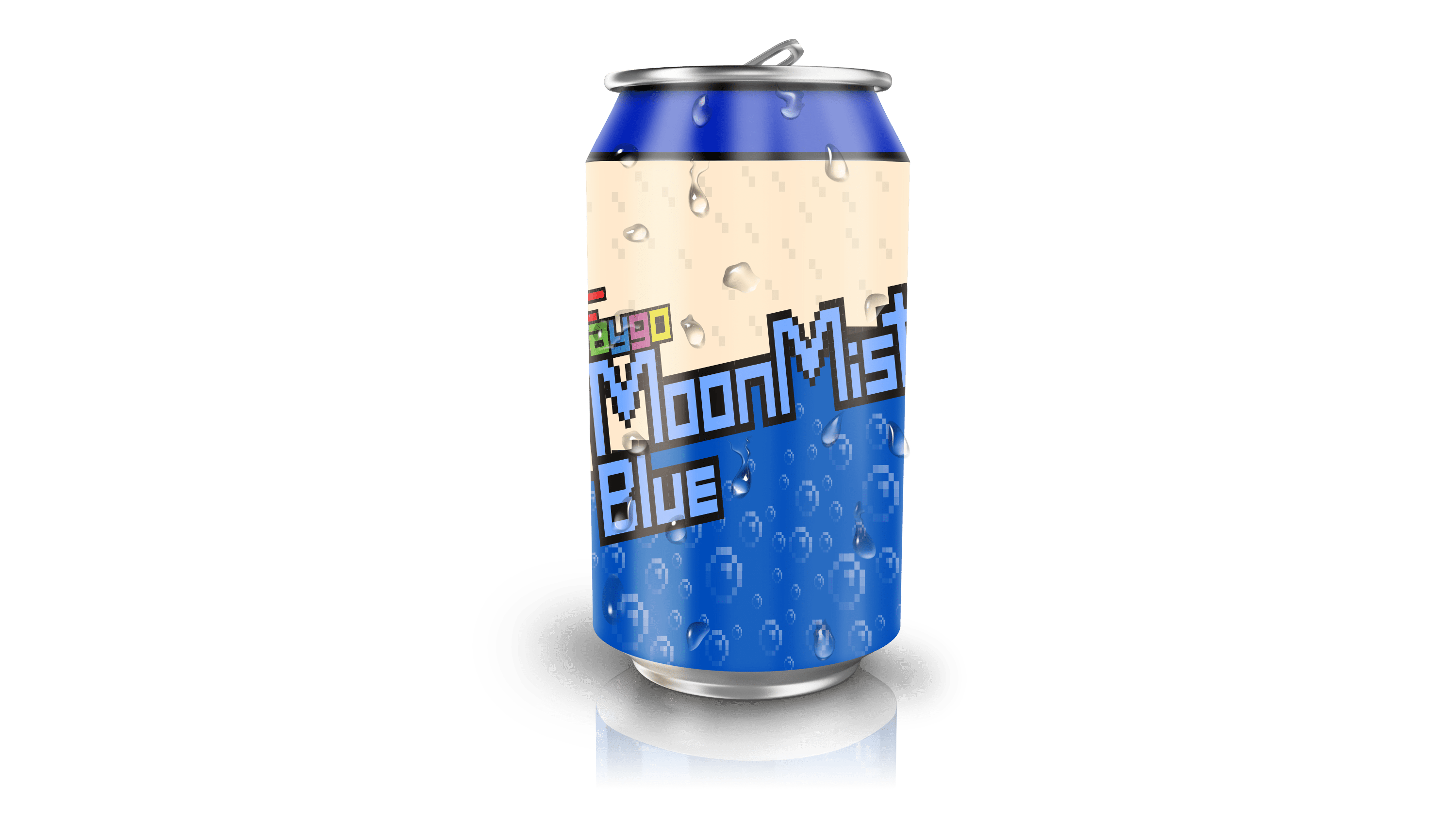
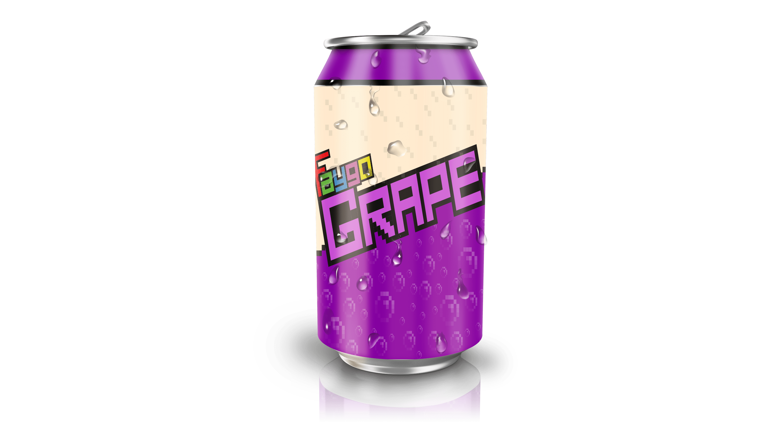
The Soda Mockups
I made soda can mockups for the rebrand to see the style on an actual soda can and it didn’t fail to disappoint. The style had a very gamey and punchy appearance. Since the style is color sensitive, it is easy to change the colors of the can and some of the type to fit with the flavor provided with the can.