Plans & Building
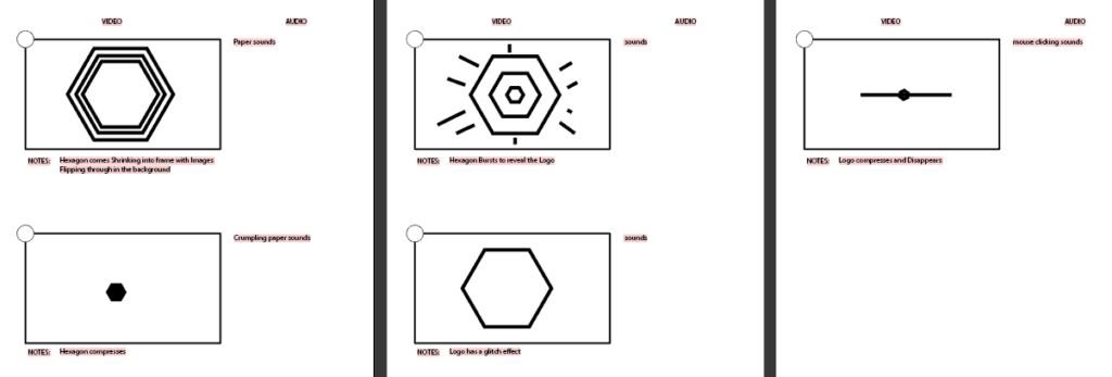
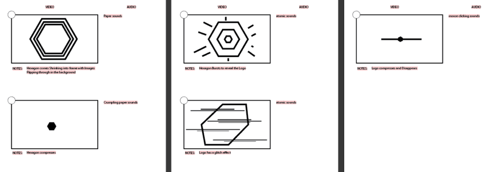
When working on this assignment, I was tasked to create a Winbreaker Self-Branding Youtube intro for my channel. The first thing that presented in my mind with the makeshift hexagon shape I’ve made when creating the logo, so I went with the concept and compiled it with some modern practices that provide the Intro animation some structure and aesthetic.
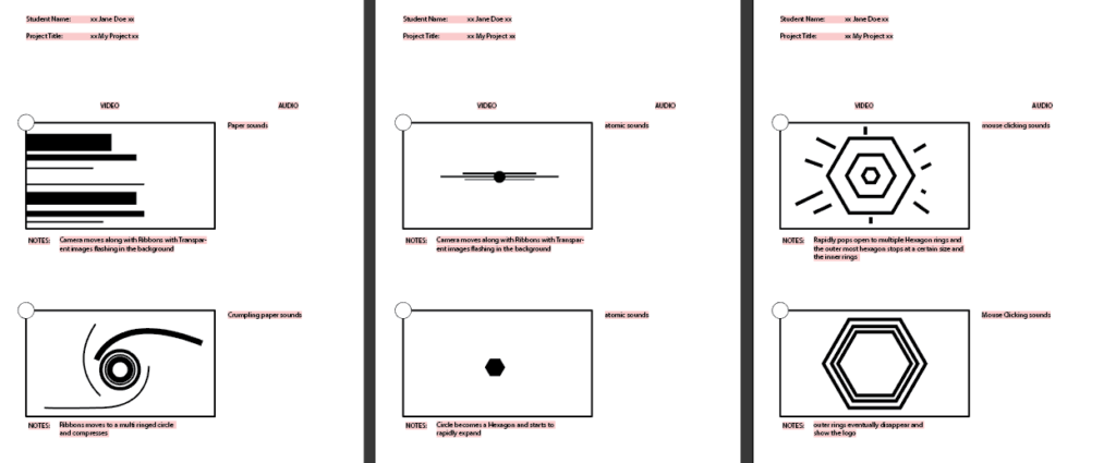
I decided to go with a shape compression to a pop effect where it reveals a hexagonal camera aperture and with colors at the space between the edge of the exterior of the hexagon as the center reveals a taste of the work I do. I also applied a track matte to the very end of the animation to reveal my logo in its own fashion.
Thoughts
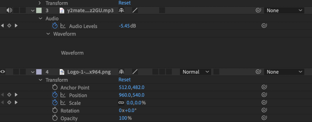
When making this youtube intro, my approach was to avoid using preset animations form exterior sources and be different. During the process, I started thinking of a glitch effect but changed it because of the cliche with many other youtube videos. Overall, I am satisfied with what I have in the time crunch and with limited resources obtained within the time crunch. If i had more time to work on this, the animation would be similar to my original storyboard where shapes converge tot he logo. This Animation also needs some tlc to Visual Balance, judging by the speed and movement being stiff and too linear

