Windesign is the very start of how my brand became to be. I started off with only sketches, really rough sketches of my initials. I was mentioned later that I should try with the pronunciation of my last name since it sounds like the term “WIN”. I then started playing with the words and resulted in Windesign. Sadly, months later I found out that the domain isn’t available, so I went with WinBreaker.
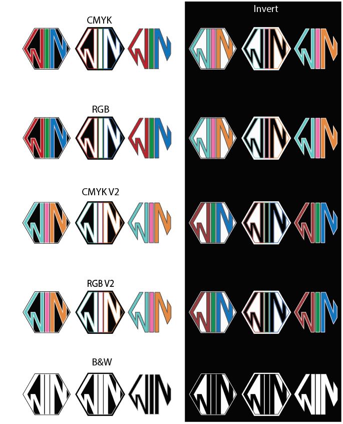
Windesign Logo
When I was making the logo I was trying to go for a more badge look along with a Monogram style. so then I worked with a base of a hexagon then began cutting it apart to see what makes the balance between negative and positive spacing happen. I also went with the mentality that “if it works in black and white, then it will work with color.”
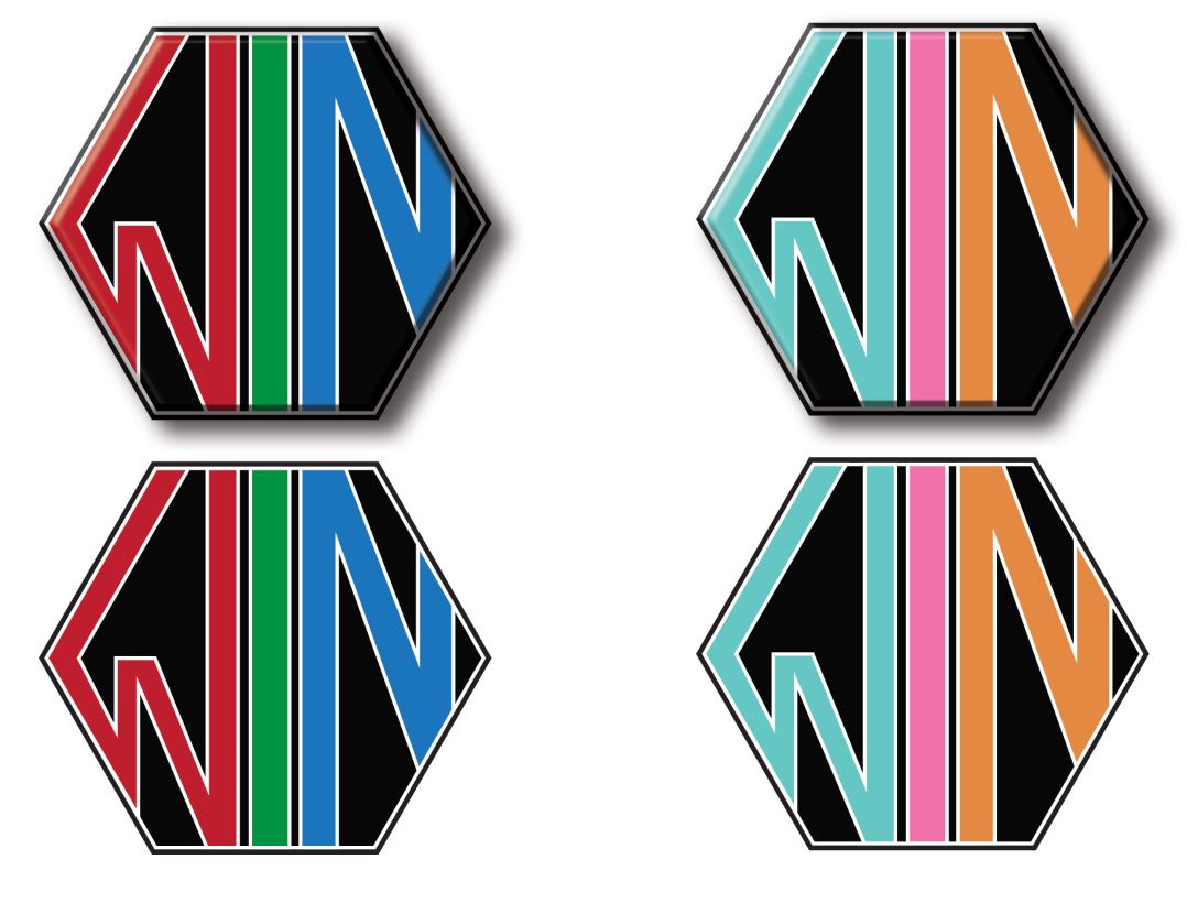
Prints
I made a series of prints based on my brand. I also picked a color scheme that would fit well for the brand which was a washed out red, green, and blue stripes. I then went with only going for a white or a dark grey background since the colors will not harm the appearance of text when created as a print. Business cards and 8.5/11 layouts are a good example