Finding the Infographic Style
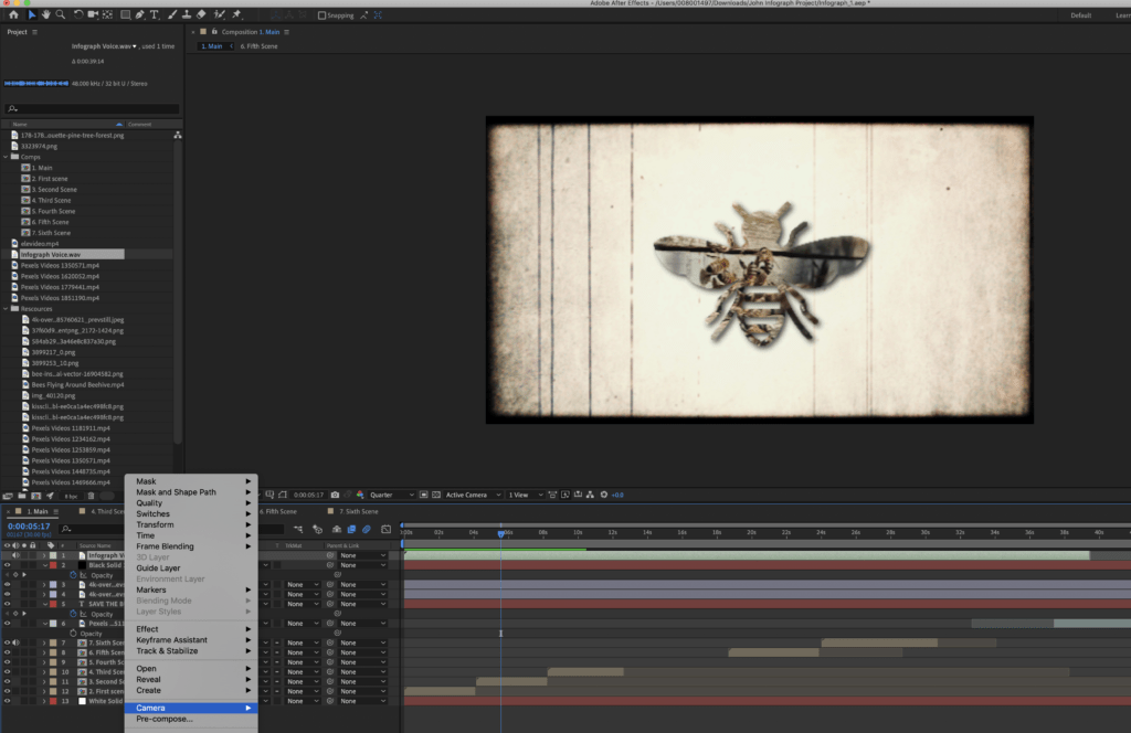
When creating the Animated infographic the main obstacle for this project was creating a unique style avoiding the typical flat design of animation, after a while of looking through the internet for unique styles. I found a style where a video clip is masked out by text or a shape. The clip is self is still playing content but the visual of the clip is only limited to the shape that is enclosing the Clip.
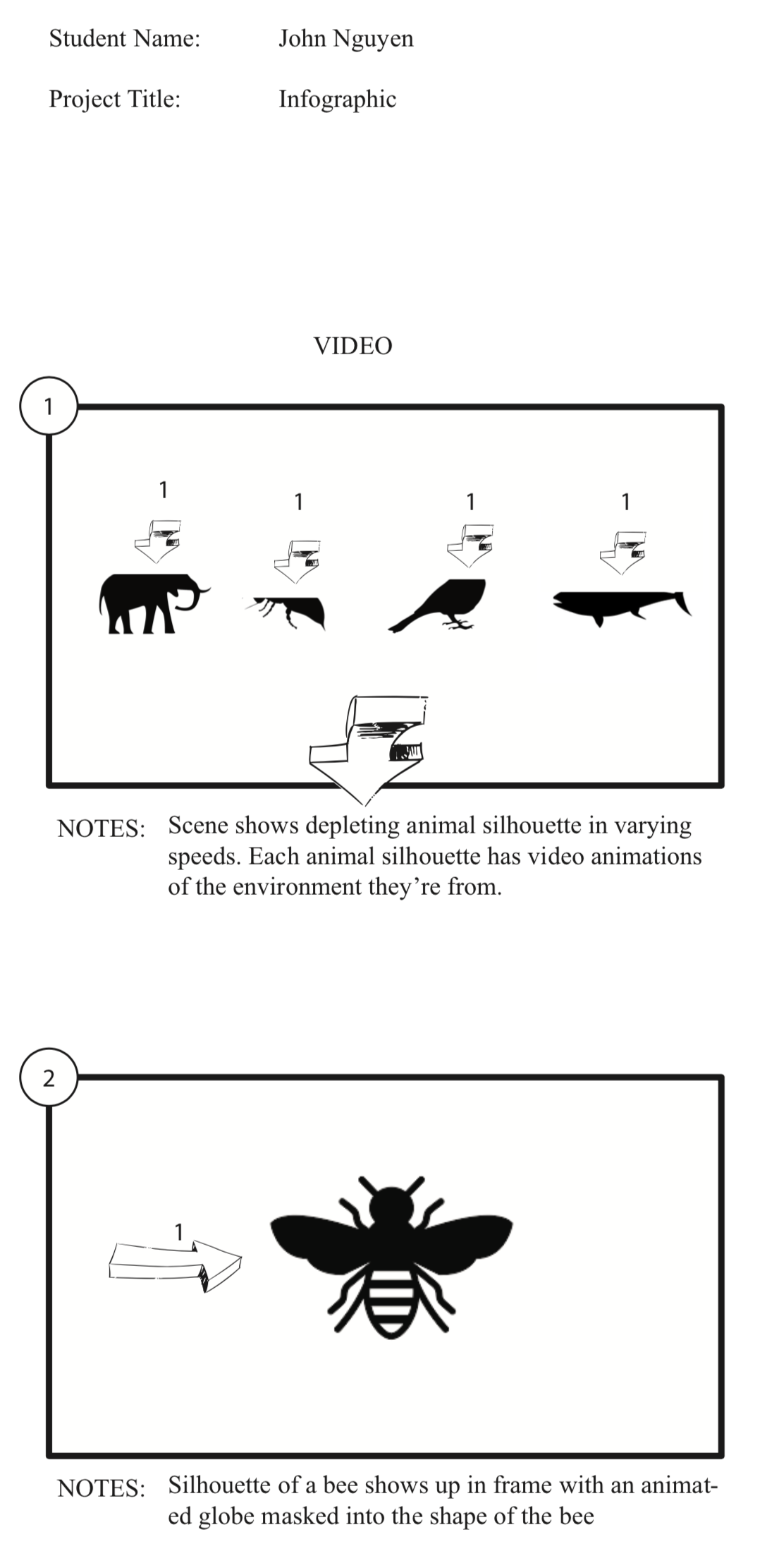
When Animating, I have used different methods to achieve this animation compared to my kinetic type and every other animation I have done in the past. An example is the use of Comps as scenes. When creating a comp, I animate the entire scene that imitates a scene from the created storyboard (See Below)
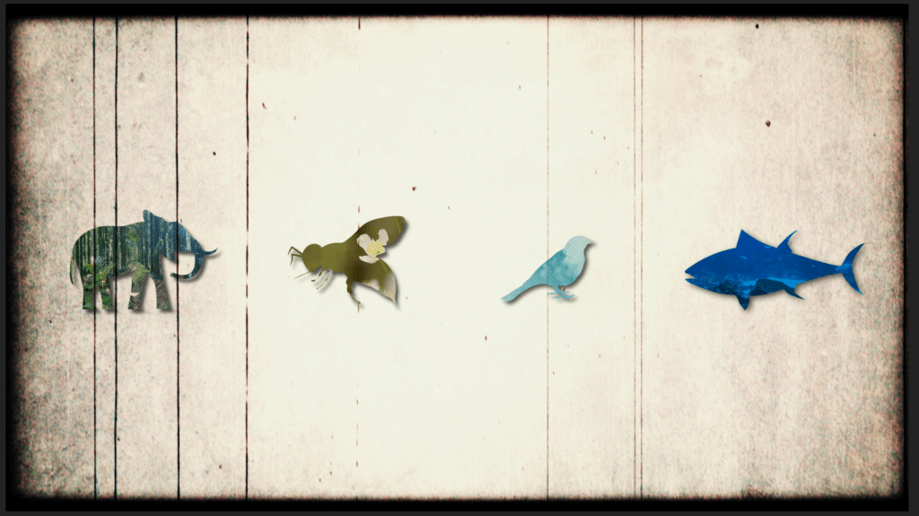
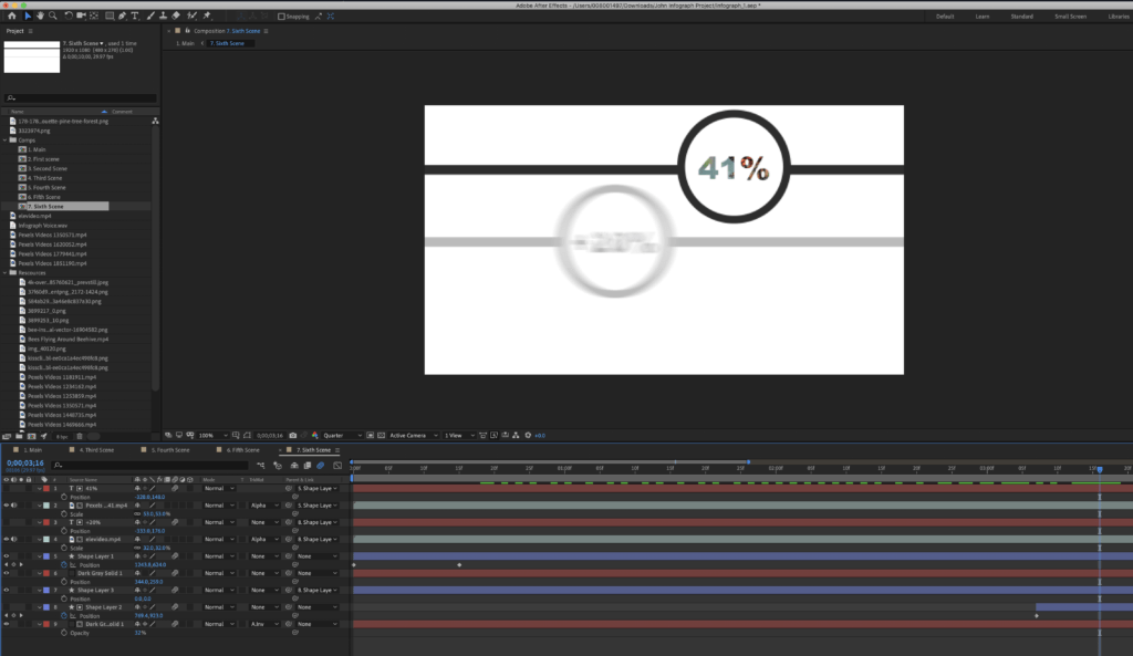
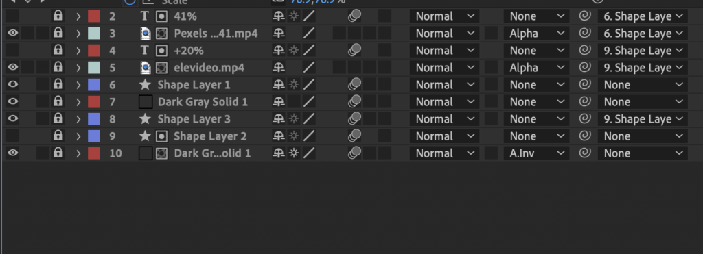
Working on the audio was one of the tougher parts of the creation, having to deal with meeting time limits and cutting off audio content and creating dead air was one of the most nerve-racking parts of the animation. When creating the animation, the first time I tried to apply the masking on some stock footage from Pexel, the footage ended up as square boxes, later on, I figured out by creating them into files containing alpha channels like PNGs, AIs, or PSDs to finally apply the alpha matte. (See Below)

